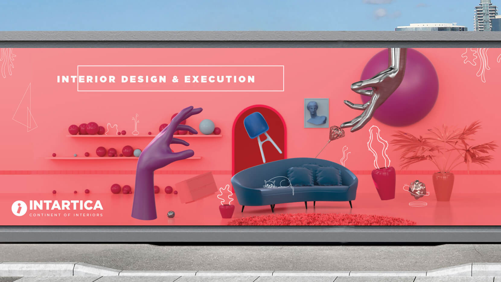
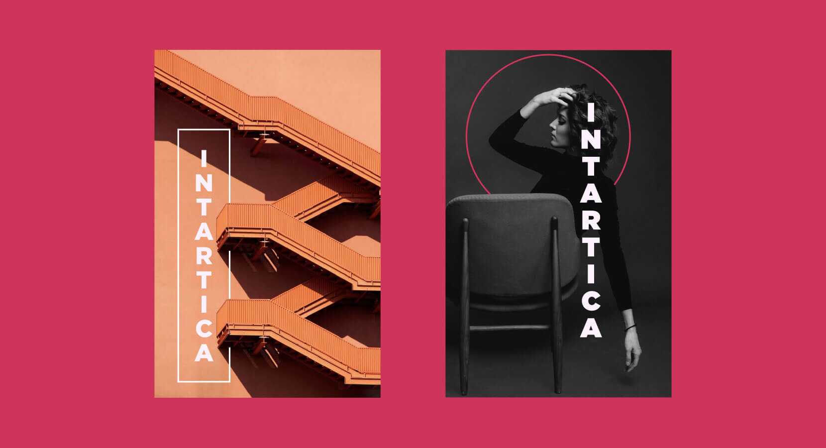
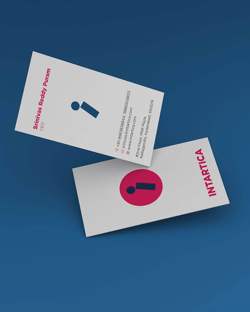
For the logo design, we applied a non-traditional approach by avoiding the repeated “home” icon but preserving the aesthetics of interior design and development. Major highlights of the logo are

1. the simplified representation of the letter “I” emphasizing the balance and focus exerted in the Seven stones game (pitthu), and
2. the use of geometric shapes from abstract paintings, and architectural shapes.
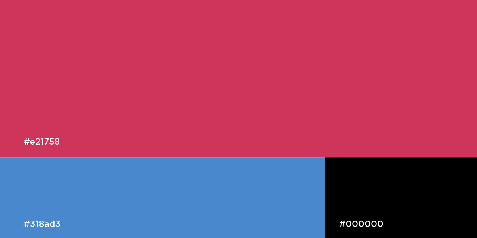
The color palette is very bold, embracing shades of blue transitioning to violet/purple. Design-engaged observations are closely related to behavioral sciences.
Studies have shown that in most cases, the male partner shortlists the design company and the final selection is primarily done by their female partner.
The chosen colors enabled us to achieve gender-neutral communications and give the brand a regal character. The darker colors demonstrate intelligence and authority which strengthens the customers’ belief in the brand.
I am very pleased with the work done by Palette69. Our new identity and website has helped us grow our leads and customer engagement so dramatically. We appreciate their attention to detail and creative approach to bringing our brand a new life.
Srinivas – Founder, Intartica
Feel like sharing our work? Here you go.
Next project