Are you up for an emotional ride? Not the tear-jerking scenes in The Notebook or Adele’s soulful ballads but a journey where we explore designing user experiences that evoke various emotions. As designers, we have the power to create products and experiences that genuinely resonate with users tapping into their emotions in ways that make them satisfied customers.
In this article, I will reveal how to incorporate empathy, storytelling, colour theory and nudge theory to design for emotion. Plus I’ll showcase some fantastic examples of emotional design that will make you smile or cry and even take your breath away.
So sit tight as we traverse the landscape of emotion-driven design!
Empathy: The Heart of Emotional Design
Empathy is a term regularly bandied around in the realm of design – but what does it truly signify? And why should designers care about possessing this trait?
For designers who seek to create excellent user experiences through their products or services – empathy means understanding the feelings and requirements of users when developing solutions. Practising empathy ensures designing products that enhance customer comfort while satisfying their needs meaning that consumers maintain long-term relationships with brands they trust and continued to use over time.
But how can one practice empathy in design? Well, it’s not exactly rocket science we’re talking about here- more like studying someone’s shoes! You should undertake thorough market research by watching potential users interact with your designs so you can empathize better and understand their struggles or objections. Listen carefully during user testing sessions so that you can eliminate pain points which will ultimately lead to finding effective solutions and achieving greater satisfaction levels among end users thereby establishing brand loyalty in the marketplace long term.
There is no doubt about it – empathy plays a significant role in user experience design as confirmed by various academic studies conducted on this topic over time! Design-orientated companies have outperformed the S&P 500 by a staggering margin of 219% over ten years as per a study from the esteemed Design Management Institute. These firms credit their success to prioritizing empathy and comprehensively grasping what their clients require.
Storytelling: The Art of Emotional Design
Design isn’t just about aesthetics or functionality – it’s about connection. And the story is one of the most effective ways to make that connection meaningful. By telling stories that are rich in meaning, emotion and relatability, designers have an opportunity not only to inform but also engage our audiences on a deeper level.
The key to crafting powerful stories through design is balance. One must skilfully interweave character development along with plot progression, and conflict resolution alongside complementary visual design elements, sounds and interactions seamlessly integrated for maximum impact.
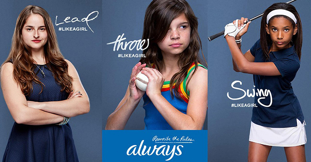
To see empathy elevated through storytelling in design visit Always’ “Like a Girl” campaign where strong girls of all ages inspire pride without apology while dismantling limiting beliefs. The campaign’s triumph can be accredited to its skilful emotional connection with viewers.
 #LIKEAGIRL – Challenging their assumptions and inspiring them to rethink their beliefs.
Colour Theory: The Visual of Emotional Design
Colours embody life’s diverse experiences by evoking powerful emotions through their vibrancy; this concept falls under colour theory in visual design. When it comes to the hues, saturation, brightness, contrast and harmony they evoke different mood patterns for individuals.
The world of colour psychology is anything but straightforward. We can’t just claim that a particular hue, like red, necessarily signifies danger, or that another hue, such as yellow, always evokes joy. Additionally- colours often create associations with specific objects or symbols which can influence human behaviour patterns through the meanings they convey.
It takes only 50 milliseconds for website visitors to assess its appeal largely based on how well an appealing colour scheme has been incorporated [1]. As such- Color psychology proves vital in influencing emotions as well as a human response when used intentionally. Interestingly, both cultures associate this captivating colour with halting because of its widespread application in traffic signals. It’s worth noting that what we perceive as culturally important can change drastically in a relatively brief span.
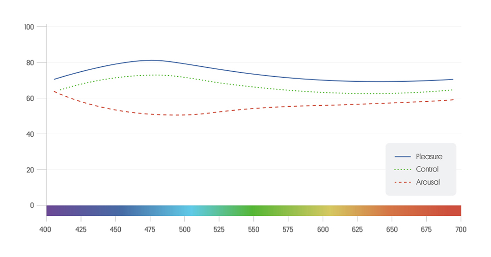
Research has consistently shown a connection between colour and psychological states such as arousal or control. One study created a chart to visually represent the relationship between hue wavelengths and emotional experiences.

The data in this chart comes from the thesis of Camgoz, N. (2000), which was extrapolated and mapped in a colour psychology guide by Cugelman, B and Cugelman, R (2020). It only includes “spectral” colours.
Our understanding of emotions continues to evolve, presenting boundless opportunities for crafting captivating messages, designing irresistible websites, and launching persuasive marketing campaigns. The sky truly is the limit!
Nudge Theory: The Science of Emotional Design
Did you know that small changes to a product or service design could influence consumer behaviour? Nudge theory is a concept in behavioural economics that advocates for such an approach.
By using subtle design interventions such as colour, typography and imagery or even changing the environment around users designers can help guide them towards making better decisions without feeling forced or manipulated. An essential aspect of this approach requires leveraging principles like social proof, scarcity or reciprocity to motivate users to take action.

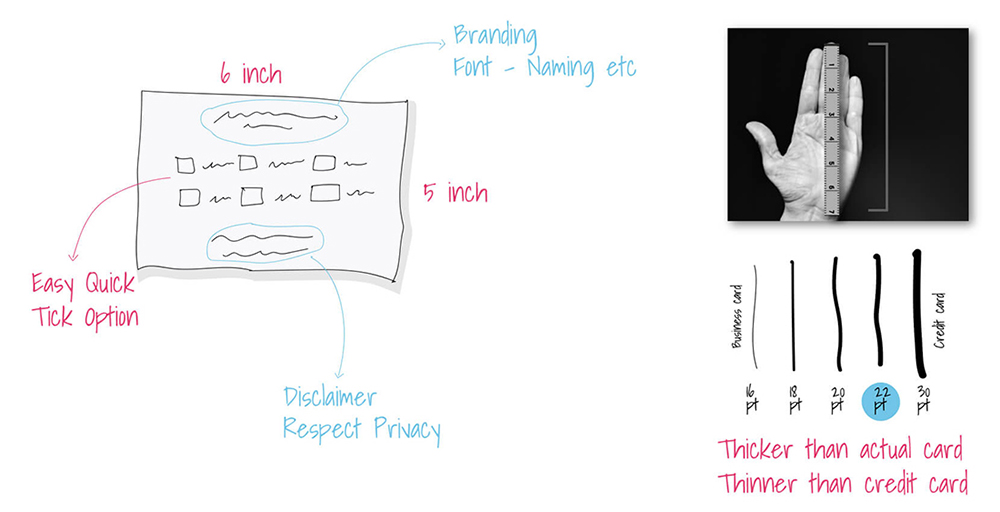
A Case Study of NUDGE in Designing a Form
A remarkable illustration of how nudge theory can be utilized in design comes from Volkswagen’s “Piano Stairs” project. Recognizing the importance of encouraging positive health behaviors among commuters using public transportation systems Volkswagen crafted a unique solution – transforming a standard staircase into an interactive musical instrument! Strategically placed within one of Stockholm’s busiest subway stations these creative steps delighted users with individual notes assigned to each level – constructing unforgettable melodies that could be played with each step taken. This engaging design not only made exercise fun but also subtly nudged users away from choosing escalators in favour of stairs promoting healthier lifestyles.
Take away’s
Having considered examples of human behaviour within certain settings you may now be intrigued by the idea of employing design for emotion in your own work. Here is a checklist that would get you started
- Determine which emotions will drive optimal user engagement and why (e.g. delight, interest, trust).
- Identify desired behaviours that will support emotional drivers and achieve strategic goals (e.g. increased sales).
- Understand your intended audience, their needs, limitations, and concerns, and how they respond emotionally to similar designs.
- Craft something truly valuable for users’ well-being, not just something that appeals on surface levels.
- Invest in establishing robust advertising methodologies to draw clientele and increase profits.
- Leverage digital channels such as social media to enable seamless engagement with target audiences.

