
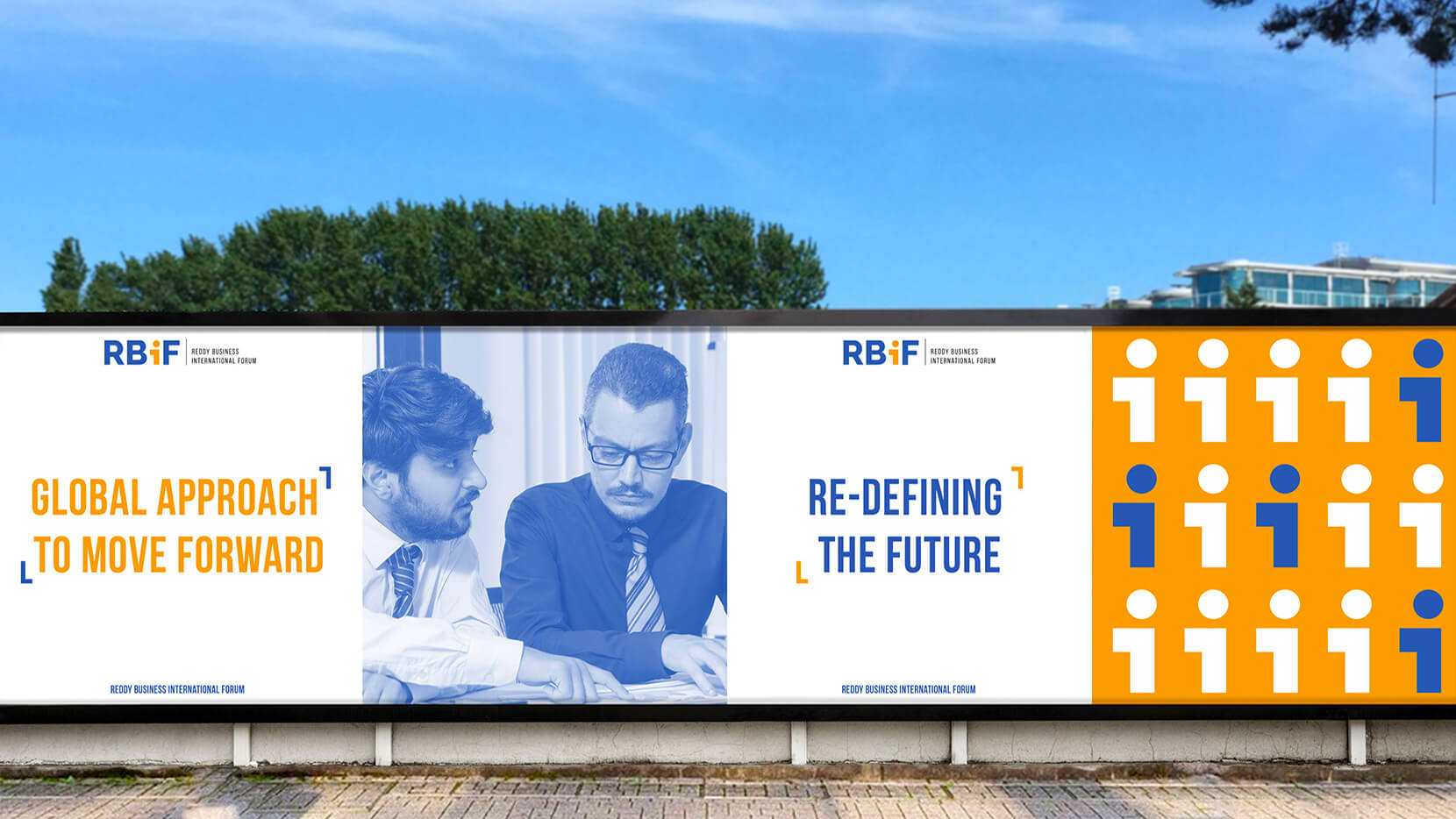

The logo represents the powerful and bold personality of Reddy’s in “RBIF” and the “ i ” shaped person represents every individual in the community that benefits others in advancing their business.
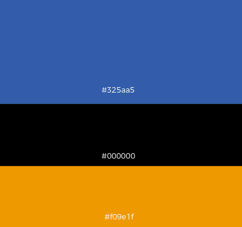
We applied the blue, black, and orange color palette where blue highlights the trust and depth of the organization; black represents the age-old power and elegance of Reddy’s. Finally, we chose orange for its ability to showcase vigor and dynamism, which is the modern-day approach to reinforce the importance of youth in the organization.
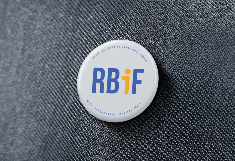
We wanted something that would give a humanized feel to our logo, as we planned to take it Global. The new logo and the identity hit that sweet spot of what we needed and how we can inspire others to join.
P. Chandrashekar Reddy – Founding Member, RBiF