Your branding efforts hinge on establishing an effective visual identity for customers to connect with one that won’t be easily forgotten after they engage with you.
The challenge lies in crafting a distinct design that not only represents who you are but also speaks directly to the desires of today’s audiences. So let me guide you through some helpful tips and best practices on how to create a stunning visual identity that resonates deeply with potential customers at first glance.
“Visual identity is not just a bold colour, a fancy font, or a logo. It is all of these and more. It is the essence of your brand, the expression of your vision, and the impression you leave on your audience.” – Pravanjan, Creative Director – Palette69
Understand Your Brand’s Personality
Creating an impactful visual identity for your brand requires a deep understanding of its personality. This involves identifying your core values, beliefs and mission – alongside exploring what kind of tone or vibe would best convey your ethos to consumers. You want people to connect with the emotions that embody your brand.
Brand personality relates to human characteristics associated with a given company (As in the paper Aaker 1997). Brands may be seen as being sincere; exciting; competent; sophisticated or rugged among other qualities that evoke specific emotions from audiences.
By highlighting these qualities through tailored visual branding strategies businesses can make unique emotional connections that stand out in crowded market spaces.
For example: if your business operates in sports then excitement & ruggedness could form key pillars on which you build. Showcasing a more dynamic side to your brand will attract and engage customers looking for new experiences, whilst a competent personality could cater towards those seeking reliable services. To boost your identity as a sports or fitness-oriented company looking for innovation-driven inspiration leads us towards creating striking slogans in vivid colours along with storytelling pictures reflecting extreme adventure that instantly connects you with the masses! Evaluating these approaches’ success requires comparing ratings against recognized industry standards.
It aids by seeking consumer feedback based on various dimensions of each aspect that portray their perceptions about what makes up these brands’ qualities better than others out there – from daring eagerness down through ruggedness & masculinity traits without any overwhelming concerns!
For instance: A Sports-focused business might be interested in assessing daring, spirited, imaginative, up-to-date personalities ranging from being tough & strong to be outdoorsy.
Choose Your Colors Wisely
Colour selection is an integral part of constructing a memorable visual identity for your brand. Colours have the power to incite feelings and convey intricate messages & meanings while also setting your business apart from competitors. According to research conducted by Loyola University – selecting appropriate colours increase up to 80% success rate in branding recognition.
However, it’s key to bear in mind the psychology behind each hue when choosing a palette. For instance, the colour blue often symbolizes trust and reliability while red signifies passion and vigour. The interpretation of individual colours is multi-dimensional and complex making it difficult to assign one-dimensional meanings such as “red=danger” or “yellow=joy”. It’s also worth taking into consideration that particular shades may create associations with specific objects or symbols that can shape human behaviour by conveying meaning. Additionally, it is important to ensure that your brand’s colours stand out amongst those already used by competitors.
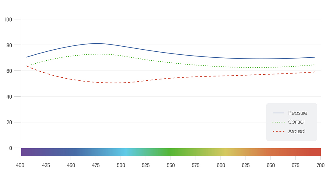
Our blog post titled “Emotional Intelligence” offers an in-depth look at colour theory backed up with research data & graphical representations which will enable you to utilize colour more strategically while evoking the desired emotional responses from your target audience
Develop a Strong Logo
When building a visual identity for your brand, your logo serves as its centrepiece. As the most identifiable element of your brand, it must be designed with attentiveness to detail. Research from the University of California Davis indicates that people are better at remembering logos than names building a more compelling case for investing in an outstanding logo design, one which captures your branding’s personality with simple yet memorable elements that uphold such values throughout its aesthetic signature.
It is important to ensure that this iconic mark is versatile enough for use on platforms ranging from business cards to billboards when considering this key design element, moreover, logos can either be symmetrical or asymmetrical – each having its own advantages concerning simplicity or uniqueness respectively; hence it is crucial to find the best fit for you based on what embodies your brand’s essence best.

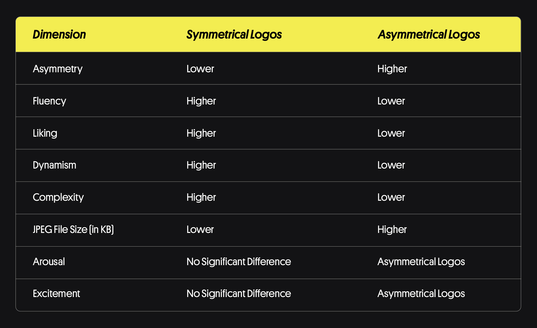
Logo design matters now more than ever in an increasingly competitive marketplace – a reality underscored by a recent study (Luffarelli et al. (2019), JMR) examining whether symmetry or asymmetry makes for better brand identities. Participants were presented with two sets of logos – one set featuring symmetrically designed features while the other consisted of asymmetrical designs and then asked to rate them across several dimensions including fluency, complexity, arousal, liking and excitement alongside file size as measured in JPEGs.
The outcome clearly favoured symmetrical logo designs over their asymmetric counterparts across multiple criteria such as dynamism and complexity while also taking up less digital storage space compared to the alternative. A key finding was that arousal or excitement levels didn’t differ between these two types of design.
The implications here are substantial given the role that branding plays in modern business environments. By recognizing symmetry as a critical feature when crafting appealing logos we can create stronger identities that resonate positively with customers while optimizing efficiency through smaller file sizes and downloads. Designers should take note of the newfound importance of symmetry in logo creation.
Of course, symmetry is not the only factor that matters in logo design. Other factors, such as colour, typography, and imagery, also play a role. However, symmetry is an important consideration, and it can help to create a logo that is both visually appealing and memorable.

Some examples of symmetrical logos include Walmart, Chanel, McDonald’s, Mercedes-Benz, and Starbucks. They are all simple, easy to read, and visually appealing. They also all have a sense of balance and order, which makes them memorable and easy to identify.

Some examples of asymmetrical logos include Apple, FedEx, Adidas, Twitter, and Nike. These logos are all asymmetrical, but they still manage to be effective. They are all visually appealing and memorable, and they convey the brand’s identity in a clear and concise way.

The decision between utilizing symmetry or asymmetry in designing your logo ultimately rests with you – however it’s crucial to prioritize producing an image that’s both visually stunning and easy to remember. By following the aforementioned suggestions forming an emblematic representation that distinguishes your brand from others won’t be difficult.
Use Consistent Typography
An integral aspect of establishing a strong visual identity for your brand is selecting appropriate typography. Your choice in typography can set the tone for communication with stakeholders and express core values such as personality and professionalism. Maintain consistency in font selection while prioritizing readability as you design your typography.
Fonts play a crucial role in establishing your brand’s identity and image. To ensure optimal readability, serif fonts are preferred over sans-serif options due to the added strokes that connect letters together seamlessly. Sans-serif choices cater more towards current design trends and minimal styles, conveying a polished and modern aesthetic suitable for many brands today.
Using script-style fonts evokes sophistication with their graceful writing style; perfect for elevating luxury-brand personas. Display font types make stunning headlines and can easily stir up bold visuals where necessary, leaving a lasting impression on viewers.
Mindful consideration of target audiences is essential when choosing a font style – young adult crowds tend towards sleek designs while professionals have well-versed expectations with traditionalism.
If you wish to get an idea on choosing the right font check out this blog “how to choose the right typeface”.

Consider Your Brand’s Visual Hierarchy
Designers must prioritize incorporating visual hierarchy principles into their work to create clear and captivating visuals that resonate with audiences. Proper organization of visual elements through this concept enables effective communication of information by conveying relative importance. Utilizing these guidelines consistently ensures consistent branding across materials while enhancing consumer understanding and retention of key messages.
Visual hierarchy can be established by tweaking multiple components such as size, colour scheme, contrast methodology, alignment process whitespace technique and typography approach. By skillfully implementing these choices you can craft a visual hierarchy that directs the viewer’s attention towards specific design elements with varying levels of emphasis.
You may choose to make your logo prominent by making it bigger in size or utilizing bright hues while keeping the tagline subdued in comparison. The utilization of contrast methodology or tactical alignment practices may create the necessary distinction between principal content and sidebar or footer elements respectively.
Effective brand materials rely on the strategic use of visual hierarchy. This technique directs attention to essential information, enabling a coherent message throughout all promotional channels for increased familiarity and confidence with potential customers.
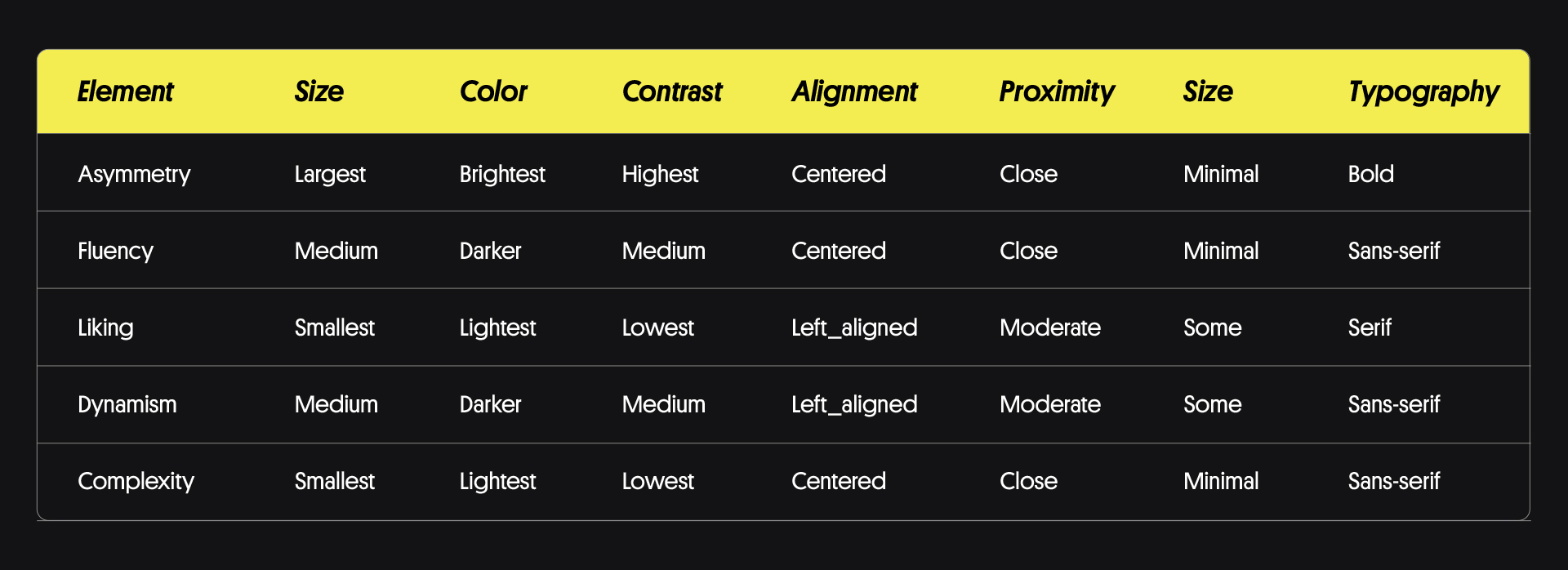
Here is a hierarchy design chart that you can use to design your brand’s visual hierarchy:
Consistency is key when creating designs for different contexts; thus, it is fundamental to maintain a regular style across all materials executed. Evaluating your designs in multiple device settings to confirm their readability under various conditions is important. To improve designs further, seek opinions from friends, family members or colleagues since diverse perspectives can provide insightful observations.
Ultimately, a winning branding plan must include an impactful visual identity which accurately represents the ethos of your business. By paying close attention to such key aspects as your brand’s individual character traits when selecting complementary colour palettes, giving careful consideration to exemplary logo choices, enabling consistent use of typography throughout all materials and carefully the application of design hierarchy principles, you will be able to create a visual representation of your brand that truly resonates with audiences, the wider marketplace, and future brand supporting campaigns.

