


A DASH OF THE BRUTAL WITH A HINT OF THE RETRO
Taking a look at UI design trends in 2022.
With the extravagant fashion that one sees at the Met Gala every year, I’ve always wondered why and how the committee chooses the theme that they do annually – what is the story behind this theme? And no matter the theme, it’s commendable that most designs are consistently thought-provoking and entertaining; watching Blake Lively’s dress unfurl and transform from bronze to metallic green was such a delight. I suppose this can be attributed to the fact that the designers do have the liberty of creating forms that may not be exactly functional; sorry Louis Sullivan.
The story behind this year’s theme wasn’t difficult to deconstruct – the over-the-top and flamboyant 90’s gilded fashion was the perfect anecdote to the morose, and let’s-please-forget-about-it vibe of 2020 and 2021. The creative ideas that lay buried somewhere deep in the nooks and crannies of the right brain of the creatives for the last two years finally got wings to fly, so why not go all out? And what we saw was design beyond boundaries.

The UX/UI world, of course, cannot be that outlandish with its themes, because the themes’ success depends on nailing usability, user experience, and pulling customers into the brand story in as seamless a way as possible. So while designs at the Met gala scream “Look at me”, the success of the UX/UI design depends on not drawing too much attention to itself, but rather to the brand that they are the first point of contact for.
So it is not surprising to see that certain themes that drew popularity a few years ago continue to make it to the top 10 UI trends chart, simply because of how functional they are. For instance, it was only a few years ago that Facebook (now Meta), would send pop-up messages encouraging me to try its dark mode. While I was a bit of a sceptic then just because of how uncommon that theme was, the dark mode is a necessary theme now for all brands that prioritize the well-being of their patrons. And of course, it does look very classy. Void, an artist’s website uses the dark theme to its advantage in showcasing its “void” concept. Haptic on the other hand is a good example of acing readability and contrast while using the dark theme.

If you notice, Haptic also uses a bold font that is the focal point of the webpage. So that brings us to a UI theme that I love – the supersized font theme. This one does draw attention to itself but the right kind of attention. In a world where distraction is the way of life, the bold fonts help us readers stay focused on the important information. It reminds us that fonts are the foundation of UI design and takes me right back to 1950s New York where the Choc font took over a majority of storefronts. Though designed by Roger Excoffon, a French typographer, the Choc font quickly became synonymous with Asian establishments and created quite a stir in the very exciting world of sign producers in New York. Supersized fonts, just like the Choc font, will soon become a fast-adopted UI trend for their elegant delivery and efficient communication of the brand message.
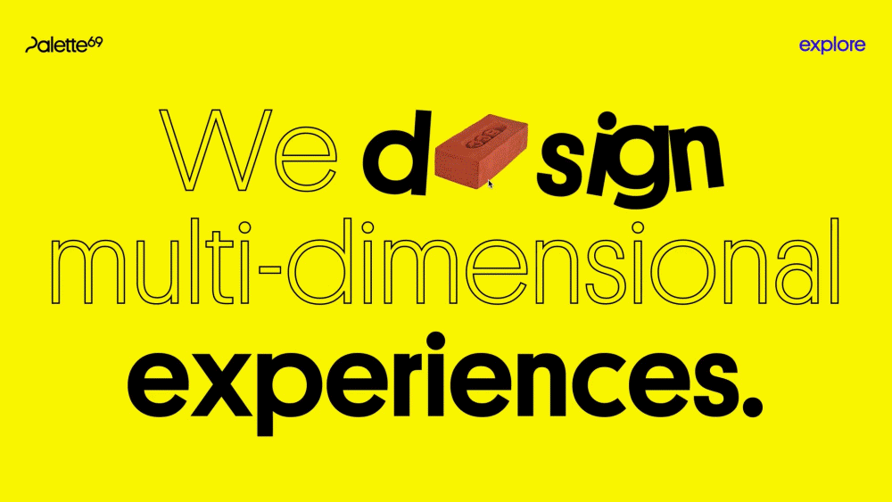
A quick plug-in here but do look at the Palette69 homepage. You are greeted with what we do in bold with some playful animation of the characters.
One UI theme that I find unique, or almost as unique as the 2004 Met Gala theme—Dangerous Liaisons: Fashion and Furniture in the 18th Century—is the neo-brutalism theme. With 1950s brutalist architecture references such as clean lines, Typical Organization is the epitome of neo-brutalism UI. It is raw in expression and has eliminated all unnecessary filigree, keeping the viewer focused on their list-like portfolio on the website.
But neo-brutalism is a stark contrast to the rising retro UI theme that depicts happiness and joy with its vibrant colours and textures, quirky typography, and retro motifs. Whether you should opt for neo-brutalism or retro UI, really depends on your brand and the target audience. For example, our message about delivering enthralling experiences would probably not be so effective had Palette69 gone for a dry neo-brutalism UI rather than the gripping and happy retro UI.

Finally, I want to quickly mention the trend of 3D UI that began about four years ago but it’s worth a mention now because of how its significance has changed with the evolving AR-VR landscape. 3D visuals are helping make the digital and virtual experiences that much more real and they fit right in with the general theme of futurism that now dominates the design and technology world. For all you know, it might be this very 3D UI trend that will draw the larger masses into the fantastic and imaginative world of the metaverse.

Whether we are looking at the future for UI/UX design trends or looking at the past for inspiration, one thing is certain – UI/UX designers cannot take the liberty that the Met Gala designers can. Customer experience, ease of usability, and effective communication of the brand message will always be above any experimental designs. And that’s not a bad thing. It just means that the UX/UI designers are challenged to let the creative exploration shine through the constraints of functionality. I’ll take a leaf from Frank Lloyd Wright’s quote and stick my toe out to say that UX/UI is the brand, not an outcome of the brand.
